
")


Hi, I'm Sara!
Are you the type of person that gets sucked into impulse-buying something because of a convincing ad, or the pretty packaging, or the false FOMO experience? Then stay far away from Haus’s website. Their marketing is too advanced.
Haus is an online alcohol retailer, focused on reinventing the industry through their unique aperitifs. Why am I telling you this? Because I (still) barely even know what an aperitif is, but they got me to spend $60 on a bottle and a tote bag with their logo anyway. And that’s the point of today’s post. Keep reading for an in-depth case study of why Haus’s website and email marketing efforts are immensely successful, and all the valuable lessons you can learn about digital marketing to implement in your own business.
(It all comes down to them knowing their audience inside and out. But we’ll get to that.)
I’d seen a few Instagram ads for Haus pop up here and there, but hadn’t really paid it any mind before; I’d never considered buying alcohol online, let alone an aperitif (what even was that? I had no idea at the time).
I wasn’t formally introduced to Haus until a brand messaging client of mine (Wilda, my queen) listed them on my client questionnaire as a brand she was inspired by.
Quick side note: when you hire me to craft your brand messaging for you, I send a personalized persona questionnaire that asks you to answer all sorts of questions to provide me as much context as possible for the project. One of those questions is “which brands’ values do you feel most closely align with yours?” and Wilda added Haus to her top 3.
Now, prior to creating what I call the Brand Messaging Book for my clients, I do a deep dive into the websites of these ‘inspired-by’ brands, so I can fully experience them and understand why my clients resonate so closely with their message.
As soon as a clicked on drink.haus I immediately knew why Wilda was so drawn to them. Everything was perfect.
From their website design, to their copywriting, to their core messaging, to their imagery…it was like I’d hit the jackpot for “websites to use as examples of how it should be done.”
I’m not kidding you, I read every single element of copy on that site, and there was only one place I would have done something differently. I literally emailed their customer service team to ask who their copywriter was so I could compliment them on their work (The answer? The internal marketing team. Amazing.)
Because the purpose of this post is to help you understand why Haus is such a great reference point, I’m going to go over the reasons why their website works, and how their email marketing supplements their bomb site in a way that makes not purchasing from them impossible—even if you (like me!) don’t give a single you-know-what about aperitifs.
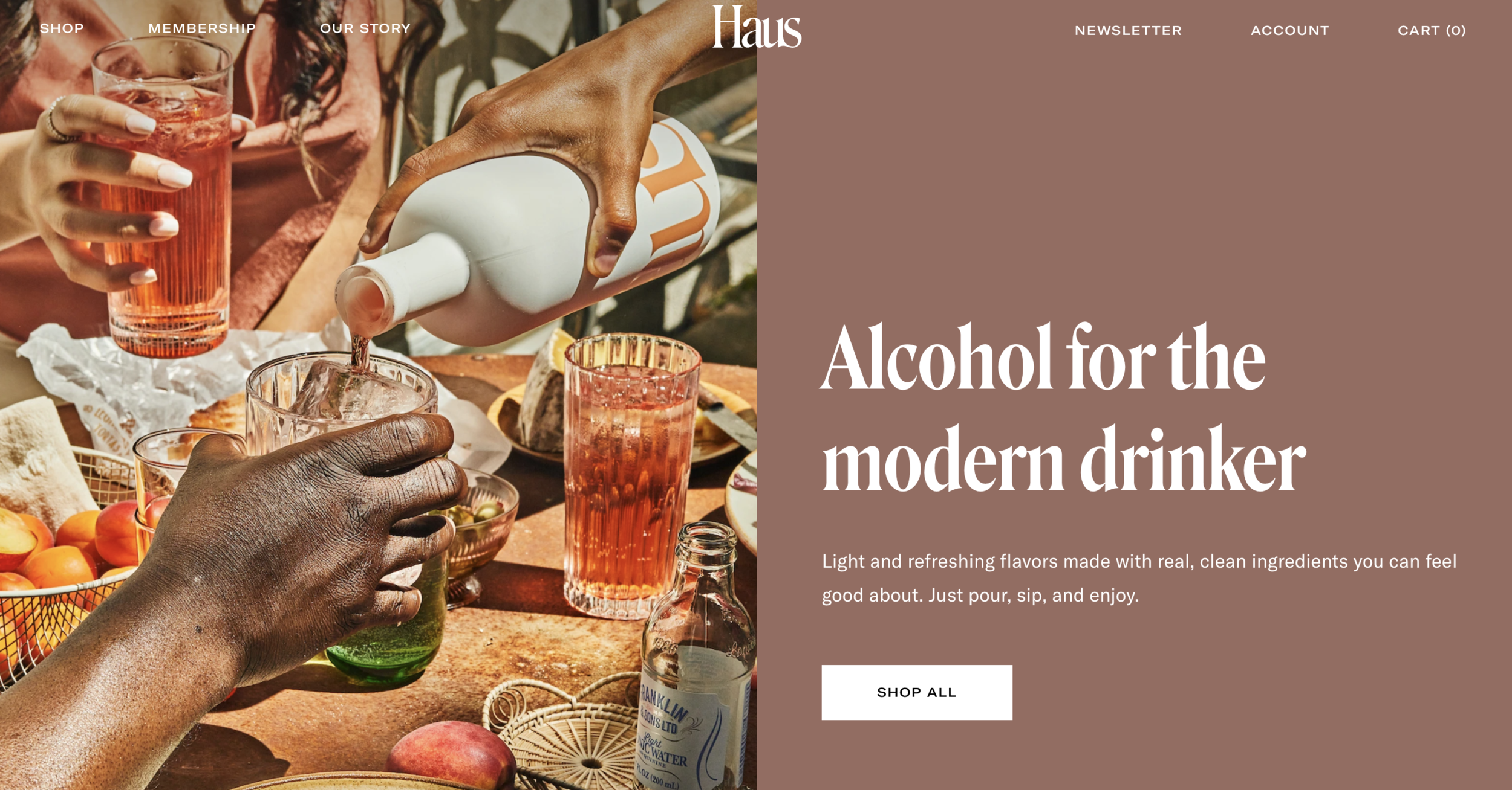
1) They have a clear message that their audience can immediately resonate with.
When a potential customer lands on Haus’s website, they’re able to immediately tell what the product is, who it’s for, how it’s made, and—most importantly—why they should want it.
Everything is spelled out for you in plain English, so nothing is left to the imagination. This is one of the main reasons why I love Haus so much: they could not be more direct if they tried. As a copywriter, I find that this blatant directness always wins over any other strategy.
I’ll often ask my clients to describe their brand’s core values, or their main offering, or their overall vibe, and they’ll first start out with something extremely straightforward and direct like ‘wine for people who aren’t wine snobs’ or ‘attainable luxury for people who don’t want to pay designer prices.’ And then they’ll quickly follow that statement up with something like ‘…but not that, we won’t say it like that.’
And my first thought is: why the hell not?! That’s how other people will understand it best. Not enough brands are willing to be so direct, even though most consumers prefer it, and are drawn to it. I won’t harp on this point too much—that is definitely a whole blog post for another day (coming soon!)—but I do want to say this:
Think about all the ads and commercials that give you pause. The ones that make you say ‘why didn’t anyone else word it like that?’ or ‘exactly!!!’ or ‘wait, that’s so true.’ Those are the brands that chose to opt for abundantly clear over clever. You’d be surprised how many times brands miss the mark because they’re overthinking, when all they had to do was take exactly what their audience wants—and exactly what their brand does / who their brand serves—and say that.
2) Their homepage was designed for conversion.
Now, this is the part where I remind you that I’m primarily a website copywriter. Writing website copy is about 60% of what I do from 7-4 each day.
(The remainder? 30% writing launch copy, 8% email addiction, 2% TikTok. Email marketing and brand messaging are in there somewhere, too, somehow—freelancer superpowers, obviously—but we don’t care about them right now.)
This website? This sh!t converts. I don’t even need to see their analytics. I already know. Here’s the overview:
-
Start off strong with a direct headline (which could likely be better optimized for SEO, but I won’t fault them for it)
-
Supporting subheader right under that headline, giving you context
-
Straightforward reviews from impressive, well-known media outlets
-
Clear brand statement (remember that directness factor? we see it working here!)
-
Best-selling products with short, impactful descriptions and call-to-action buttons to shop directly
-
Trendy image and a section dedicated to what is clearly their most FAQ – “what is an aperitif? “- with a clear answer
-
3 key pillars that will convince unsure leads (see #5 for more on this!)
-
Five-star testimonials from ‘verified buyers’ (why are they verified? what does that mean? we don’t know, and we don’t care, because we’re taking it for what it is: necessary social proof, even if it’s completely baseless)
-
A nod to why they deserve your business over their competition (see #6 for this!)
-
Effective, minimal footer with a clear direction of where to navigate to next
And that, my friends, is an amazing, effective recipe for a perfect homepage. Speaking of…
CLICK TO DOWNLOAD MY FREE HOMEPAGE HOW-TO GUIDE
3) Their imagery makes you want to be part of the experience.
Haus’s creative team obviously knows what’s up. The images on their site are the perfect blend of casual and elegant; and they’re perfectly on-trend right now with that grainy, chill, film-esque vibe. If inputting a million pictures from their site wouldn’t piss off the SEO gods, I’d be adding them in here. But I already knowww this post is about to be a long one, so I’ll let you check ‘em out on your own. I promise, you’ll see what I mean by “part of the experience.” It’s clear their goal was to show off how their aperitifs are meant to be enjoyed, and when, and with who, and in what setting.
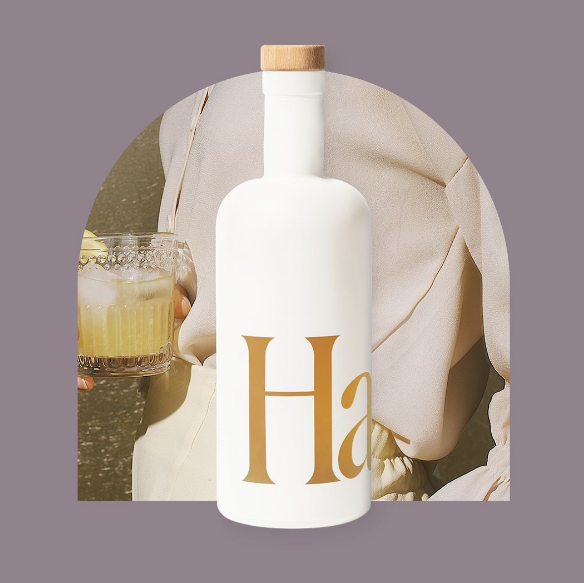
4) The branding and packaging design are both so on point it hurts.
Everyone loves a gorgeous typeface, and everyone loves a minimal packaging design – whether they realize it or not. If I were to walk into my bathroom right now and take out every beauty product I bought just because I thought it was pretty, that’s what they’d all have in common: strong font, minimal packaging.
This is because we’re drawn to brands that seem to have authority. When a brand is bold enough to package their product with only their brand name on it—we’re automatically intrigued. Why are they able to do that? Should I know what this brand is? Are they that cool that all they have to do is put their sick logo on a bottle and it’s worth $40?
Aaannddd that’s how they get you to buy an aperitif when you don’t even know what the F that is. Or, at least that—and their email marketing, which I’ll get to in a few—is how they got me.
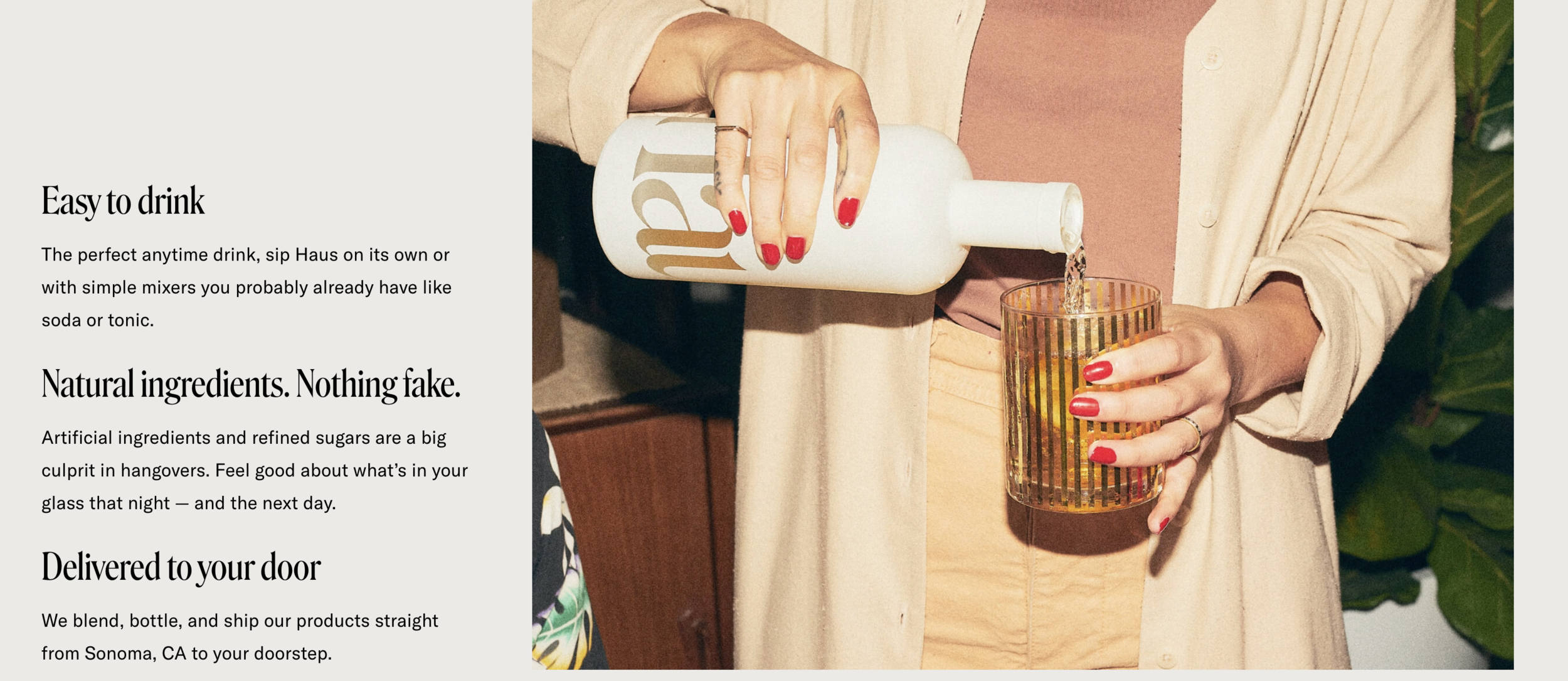
5) Their key pillars really drive the (selling) point home.
There are a few different types of buyers, but for the purpose of this section, we’re only concerned with two: the one who knows what they want and is headed for the Shop page, and the one who may be willing to spend money but is still in exploration mode.
You’re only going to scroll all the way to the bottom of a homepage if you’re that customer in exploration mode. You’re curious! You want more context.
On your way down to the bottom of your scroll on Haus’s website (which, strategically, isn’t that long, but I digress), you’ll find their key pillars:
A lot of brands have trouble differentiating their core values from their key pillars, and when they get it wrong, it shows. Core values are typically ‘me-focused’ where key pillars are ‘you-focused.’
I know, I know: that was copywriter jargon. I’ll explain:
When you’re writing website copy, your focus should always be your reader—not your own ego. It’s very easy to get caught up in saying things like “I want to…” and “I offer…” and “I’m an expert in…” but that’s just going to come across as a lot of me me me. Readers are inherently selfish; they want to know what you can offer them and how you can make their lives better, or more interesting, or more enjoyable. And they want to know that information, like, yesterday.
So, when I say “you-focused” I mean that Haus focused only on the benefits they’re providing for their customer, easily feeding into that selfish reader’s need.
Haus’s execution of their key pillars was perfect, because it acts as a catch-all ‘here’s what you need to know so you can be confident in your investment’ section. In an easily digestible, no-bullshit, 8th-grade-reading-level (always what we want!) type of way, they list out the benefits of purchasing their product, and why you should purchase it from them specifically.
Here’s a quick rapid-fire of why each pillar works so well:
-
‘Easy to drink’ section: tells you that you don’t need to have a fancy event planned to enjoy the drink, and that you don’t need to purchase anything else for your drink to be complete (people love to use what they already have because it feels like saving money)
-
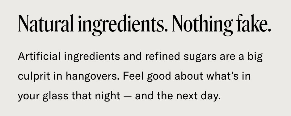
‘Natural ingredients’ section: see below
-
‘Delivered to your door’ section: tells you exactly where and how its made in a casual, non-boasting way
6) They sneakily convince you that they’re way better than their competitors.
If you’re wondering how to convince your audience that they should choose you over your competition (without getting all schoolyard “I’m better than you” or all Grey’s Anatomy “pick me choose me love me”) then you should turn your attention to Haus.
Let’s take their use of the phrase above for example. This phrase was strategically used to target the section of their audience that normally doesn’t pay too much attention to the ingredients or origins of a product before they buy, but values the information when it’s in front of them. I feel like we should call her Ivy.
Allow me to break it down: before reading that section on Haus’s website, Ivy probably read the first sentence on their homepage and thought “Cool, they use ‘real, clean ingredients’ in their stuff” and then kept scrolling, completely neutral.
Then she got to the part where they added ‘natural ingredients, nothing fake’ in huge letters (a phrase that shows up in two places on their site, I might add: not an accident) and said that artificial ingredients & refined sugars contributed to hangovers, and now she’s thinking “Oh shoot, so other brands have a bunch of fake stuff? Damn, how much artificial sugary crap have I been drinking? Is that why I’m always hungover? Yikes, I better switch to Haus—I definitely want to feel good after a night of drinking.“
And Haus never mentioned their competition once. They didn’t even say anything close no mention of ‘other brands use…’ – or anything of the sort. They didn’t have to, not yet.
They made Ivy subconsciously think their brand is better than other brands because of what was implied. Copywriting is all about brevity, and trying to see how clearly you can communicate a message in the least amount of words. They absolutely killed it with this one.
BUT—just in case the more skeptical Ivys of the Internet weren’t convinced—they went on to continue putting that doubt about other products in their head, by saying this:
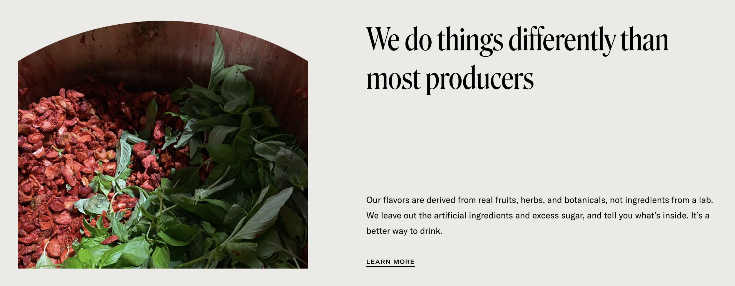
‘Not from ingredients in a lab.’ Ouch. ‘…and tell you what’s inside.’ Double ouch. If I’m a competitor to Haus right now, I’m hurting. They got me in the gut with this one. I’m taking a second look at my messaging after reading this.
This section of two seemingly harmless sentences suddenly makes Ivy think that other brands use ingredients from a lab, and that they’re full of gross, processed stuff, and that you have no idea what you’re actually putting in your body when you drink them.
And then boom: Haus is the solution to the problem they just created. That’s the main takeaway here; the #1 website copywriting lesson. Even if you weren’t thinking about why you needed their brand before, you are now.
Because they told you what you should care about. By giving these words weight—by putting them front-and-center in the middle of their homepage—they’re telling their readers what’s important, and their readers are going to be convinced.
(Plus how can you argue with a brand claiming ‘no artificial ingredients’ when its positioned next to a picture of fresh green leaves? It’s basically science.)
The best part? All of those things about the other brands are probably true. I love a good call-out.
7) Their product photos are visually appealing.
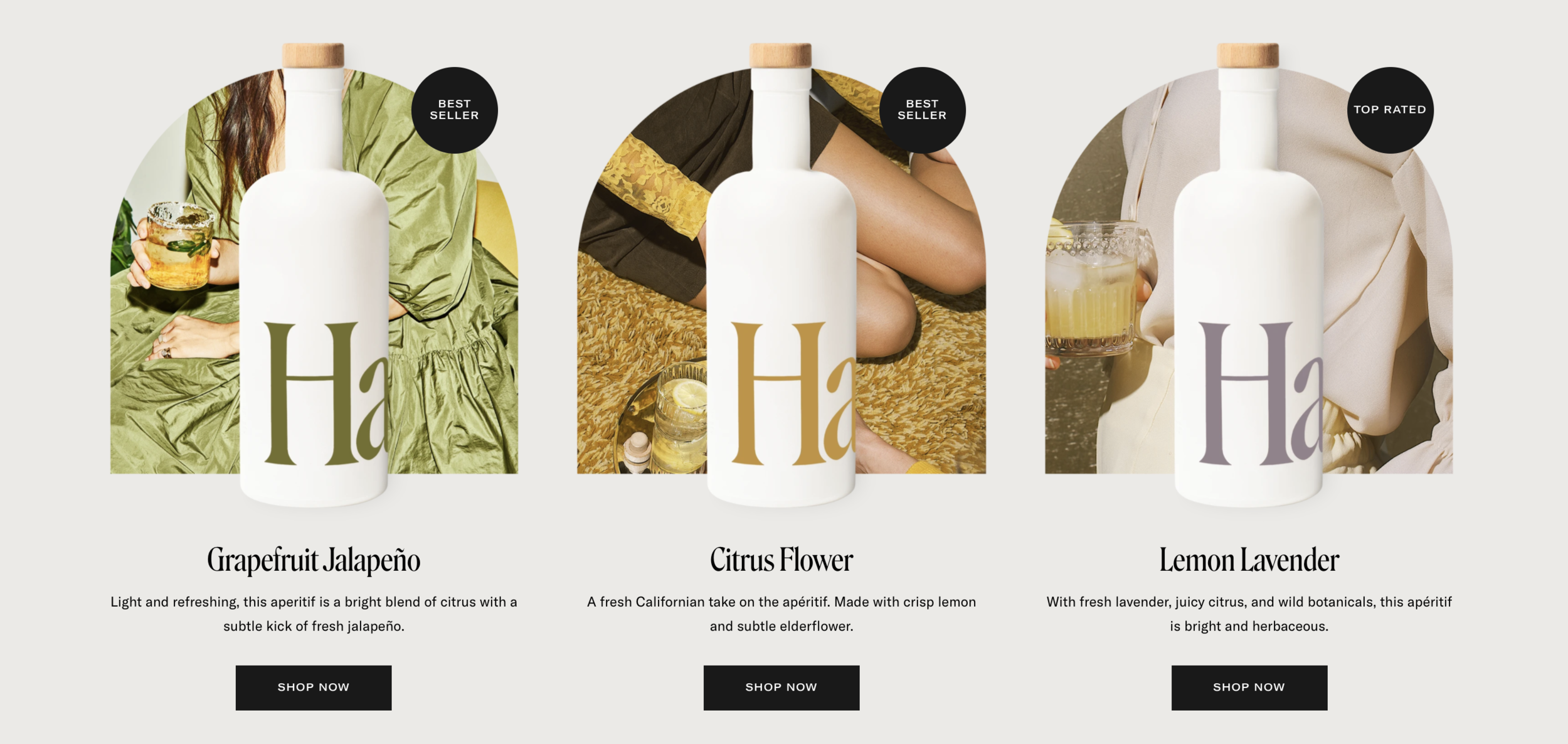
While I plan to create a whole ‘nother post about why copy and design working as a team is essential (and powerful), I’ll leave you with this: e-commerce websites have to have engaging, visually appealing product photos AND product descriptions.
There are a lot of things copywriters can do to make people want to click something, but if the design/visuals aren’t there, ain’t nooobody gettin’ sales. Now, I’m gonna go ahead and let the photos speak for themselves.
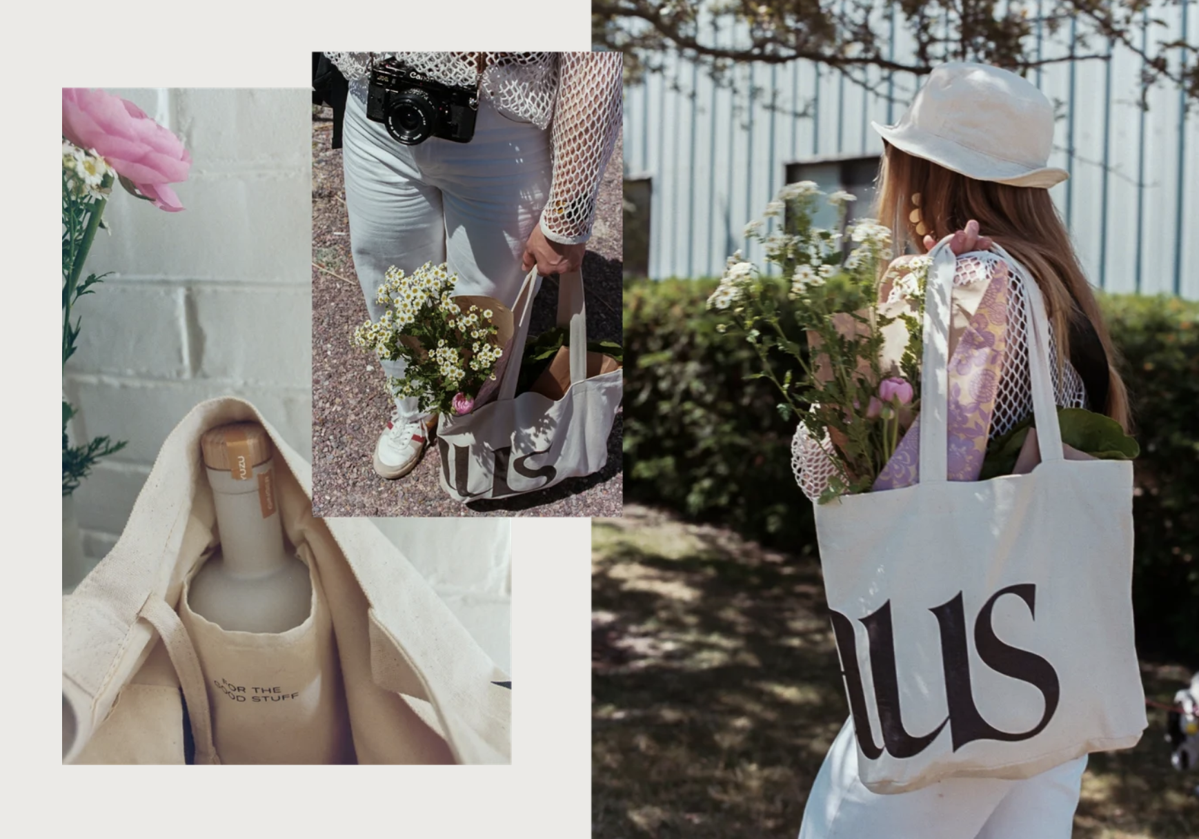
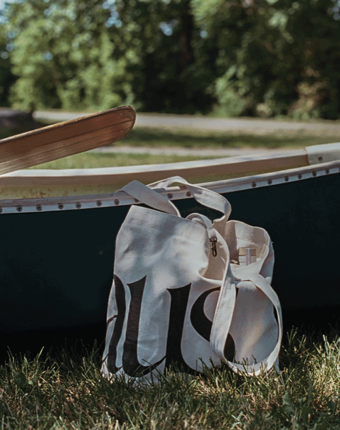
Honorable mention: their tote bag. Period.
This should be the part where I tell you about how I got sucked in to purchasing it (which is what inspired this entire case study, because I knew I loved Haus as a copywriting example before this, but getting that in the mail is what made me say OHHH so they ARE complete industry leaders in absolutely every way. Got it.)
Buuut that story belongs in the context of their email marketing strategy (see below). The reason why I’m giving the tote bag honorable mention here is because the way they market it is…so smart.
First of all, who doesn’t love a tote bag? They obviously sat around their conference room table (or couch? I feel like they’d be at a green velvet couch) and thought about their Ideal Client Avatar, and what that person would want most to accompany their Haus bottles.
Someone probably brought up a picnic.
Someone probably mentioned a cooler.
Someone else probably shot that down and said there’s no trendy way to make a cooler, Stan.
Someone probably casually suggested a tote bag with a spot to hold your bottle so it doesn’t flop around or get lost at the bottom under all your crap or leak everywhere.
Everyone probably whipped their head around and screamed THAT’S IT, THAT’S THE ONE! And immediately headed to their respective desks to make it happen.
At least that’s how I imagine it happening.
And then they decided to offer the tote bag in a set with a bottle of your choice, and slap some Free Shipping on it. Boom. Marketing Masterpiece.
Okay, NOW it’s time to talk about where my obsession with Haus’s marketing was solidified.
Enter: the tote and promo email combination. And the story of how it brought us to present-day me fangirling via blog post.
It was a random weekday afternoon, and I was just drifting into my afternoon slump. I creatively crash hard around 3pm—probably because I start working at 5am, plz don’t lecture me about balance—and I usually read through email newsletters like TheSkimm and Marketing Brew for a break from drafting my latest copy project.
I’d subscribed to Haus’s email list when Wilda first mentioned them, because I had a feeling they’d kill the email marketing game. I could simply tell from what I’d seen on their site that web copy wasn’t the only thing they’d be great at, and I was right on the money.
Now, before I get on with my story, let me remind you of something: I offer email marketing as a service. I write all sorts of emails, from e-commerce, to service providers’ nurture sequences, to course launch campaigns. I know a sales email when I see one; I can practically smell it on its way to my inbox. This one was no different, but this one was so good at creating FOMO that I threw caution to the wind and clicked ‘purchase’ within 5 minutes of reading the email.
On a bag I didn’t need. Made to hold a drink I didn’t even know if I’d like.
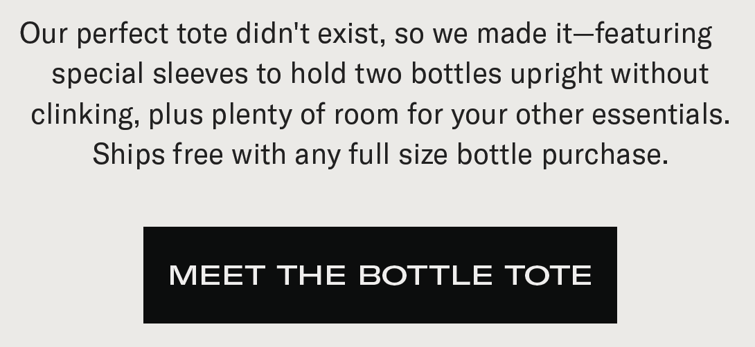
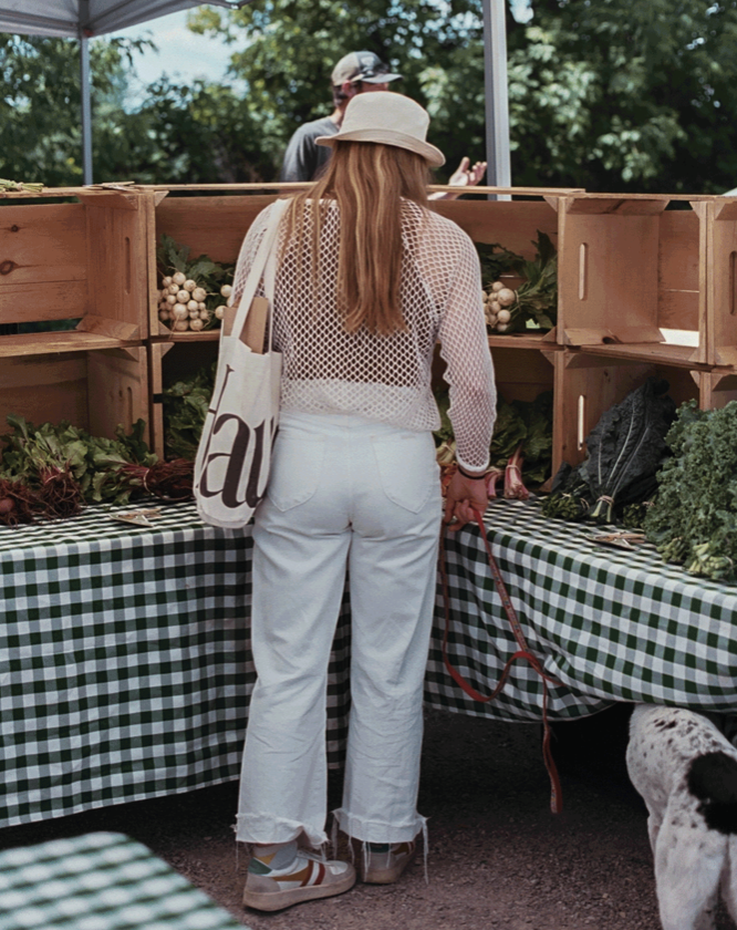
Picture this below a series of images of a trendy girl with fresh flowers, looking as if she always exists at an impromptu picnic. They had me at ‘bottles upright’ and solidified the deal with free shipping, even though that ‘free shipping’ actually cost me way more, considering I had to buy a bottle to get it.
It wasn’t even a very special email. They simply caught me in the right mood, and showed me the transformation I could have by including a small paragraph and a couple dreamy pictures.
How they knew I desperately wanted to be the cool girl who walks around with fresh flowers in her purse, always ready for a farmer’s market, looking effortlessly chic, I’m not sure. But they did. And then they used that knowledge to seduce me into purchasing their tote bag, because they promised me that it would hold a bottle and wouldn’t spill.
Obviously, they capitalized on the fact that everyone wants to be able to safely carry a bottle in their bag, confident that it will stay put. And not specifying that it had to be a Haus bottle was genius—because the first thing I thought of was my Simple Modern water bottle; it has a straw, and no lid that closes the bottle, so I always have to carry it for fear of it leaking everywhere in my bag.
Time to fast-forward to the delivery of my Haus package. I’m obviously pumped. I know their packaging is going to be as good as I’m assuming it is, because duh.
Again, I was right.
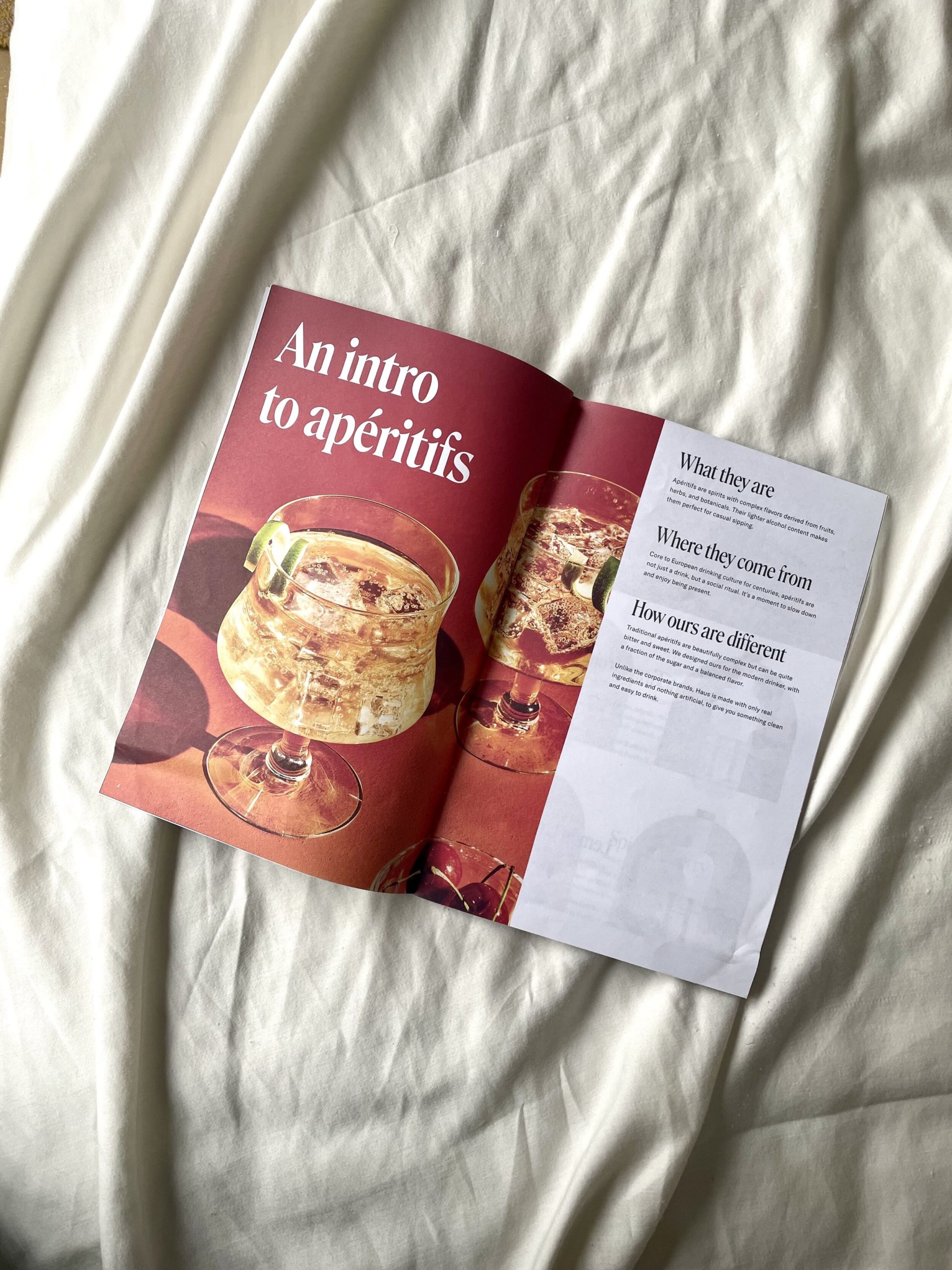
But what I didn’t know was that they were going to take it one step further and add a little sumthin-sumthin to the package.
Of course, everything was branded, and both the bottle and tote were delivered in a sleek, minimal box. What I was really impressed with, though, was the branded booklet they included. From a copywriter’s standpoint, this was absolutely genius. Not only did they deliver me my new aperitif and tote bag that I’m excited about, they gave me a literal magazine full of information about how to enjoy it.
From the family-run business’s backstory and what an aperitif is, to cocktail ideas and other products of theirs, to curated Spotify playlists for different vibes… I mean, on a scale of one to killing it, you already how I how I feel about their marketing. I could have written an entire blog post on just the magazine-style booklet alone and how genius it was. It is so abundantly clear that Haus has researched and executed everything in their power to keep their ideal customer in the know—and keep the brand top of mind—so that they’ll always be wanting more.
In conclusion? If you go to their website right now, you’ll probably leave with a bottle and a tote bag. You may not know exactly what an aperitif tastes like (despite their clear explanation), but you won’t care. You’re probably not going to open the bottle anyway.
It’s too pretty, and even though their site does everything in its power to convince you it belongs in your glass… but you and I? We know the truth.
It belongs on your bar cart.
Or in a photo in your marketing case study, if you’re a complete nerd like me who prefers to write about alcohol on a Friday night at 8:51pm instead of, say, actually going out with friends and drinking it. (I blame the ‘Roni and my international move, far, far away from my friends.)
If you liked this case study and the lessons on what makes for effective “omg I need that” copywriting, make sure you’re subscribed to my newsletter, Tuesday Table of Contents!
I send a digital marketing tip—aka a severely abridged version of this post, boiled down to just the actual tips—every single week. (Plus some other fun stuff.)
If we haven’t had the chance to *virtually* meet yet, hi! I’m Sara Noel—website copywriter and marketing mentor for creatives, copywriters, and all-around cool people. If you like my content and you want even more BTL in your life, here are a few ways you can connect with me:
Subscribe to my newsletter! I send one marketing tip, once a week – and, according to my subscribers, it’s “the best marketing newsletter on the Internet” and “the only reason to wake up on Tuesday mornings.” So… yeah. You’ll love ‘er. ? Click here to subscribe!
Check out my services. I write website copy, sales pages, email sequences, blog posts, and brand messaging guides for entrepreneurs of all kinds! Maybe you’re my next favorite client.
Read the rest of my blog. It’s home to everything from copywriting tips, to marketing education, to freelance advice, to portfolio-worthy projects… if you like this post, you’ll love the blog. Here’s a quick roundup of my most popular posts.
Sign up for my web copy course. Actually, it’s not *only* about website copywriting—I also teach modules on copywriting basics, developing your target audience, search engine optimization, blogging, and email marketing.
Enlist me as your mentor. I have an entire in-depth blog post about my one-on-one consulting process for new and aspiring copywriters, if you’re interested in having a big-sis-style mentor to help you grow your freelance copywriting business & get results.
To get in touch with me directly, send me a DM or email sara@betweenthelinescopy.com. Have a great day!
Website Copywriter and Marketing Mentor really freaking passionate about helping business owners figure out how to market themselves online with ease.
Click on any of the below topics for more educational resources!
love this post? share it!
I publish ADHD-friendly episodes about marketing every Thursday.
I write website copy for main characters who want to be must-haves.
I teach business owners how to write the best website copy for their brand.

Subscribe for one marketing tip, once a week.


Hi, I'm Sara! Website Copywriter & Marketing Mentor.
Nice to meet you,
I'm your new solution!
PLOTTING HOW TO SOLVE YOUR PROBLEMS
Through what I like to call sales-focused storytelling, I'll help you find your brand's voice, perfectly position your offerings, develop your target market, and write copy that resonates with your ideal audience. And I'll do it all while keeping your personality at the forefront of every draft, to ensure that each word aligns with your true self.
lets work together
If you're a Main Character with big dreams of success and growth and you happen to have a big, scary blank document standing in your way every time you sit down to write your own website, sales, or email copy...
Curious about crafting a compelling narrative? I'm on it.

here's how I can help
Copywriting Services
01.
Writing your own website or sales page copy doesn't have to be something you stress over anymore. I'd love to work with you to craft conversion-friendly, SEO-optimized copy your readers will love.
DIY Your Website Copy
02.
Thinking about writing your own website copy instead of hiring me to do it? That's a great plan, too! I have a zillion resources designed to make it as easy as possible for you to DIY your site.
Mentorship Services
03.
There's no better feeling than having the complete support of a trusted, dedicated mentor by your side as you navigate your journey as a business owner. I'd love to be that person for you.
work together
learn more
learn more


speed talker friendly
for the yappers
calling all squirrels
business & marketing
lifestyle
adhd
hacks
copywriting
listen on spotify
listen on apple
")
Join me every single Thursday for the only marketing and mindset podcast you won't have to listen to on 2x speed.
")
read on substack
LISTEN TO MY PODCAST
")
One marketing tip, once a week.
Join thousands of marketers being greeted bright and early every Tuesday morning by ridiculous stories that seamlessly turn into tips about copywriting, email marketing, blogging, storytelling, website copy, SEO, and selling online.

")


