Hi, I'm Sara!
I can’t tell you how many times my clients have come to me asking for help with their product page, solely because they just don’t know what the heck to put on it.
Beyond the product description itself, I can agree that it *is* hard to figure out what else to say.
…which is why I’ve created another simple, easy-to-follow website copy formula—my specialty!—this time for the single-product Shop page formula to solve that problem. 😏
Unless you’re a stranger to the frequent copywriting lessons on the BTL blog, you know by now that I love to teach by example, and today’s post is no different!
The best way for you to learn how to write a product shop page and product descriptions for your online store is to literally show you how it’s done—and thanks to Chill Haus Club (and their rolling tray!) that’s exactly what I’m going to do.
Chill Haus Club is half cannabis accessory store, half community for cannabis lovers.
IRL, they offer immersive + private events for members of their Club. Online, they sell stylish cannabis accessories that blend with your home, share valuable content about their favorite flower, and provide space for members to connect, network, and create with one another.
The common ground? An elevated level of chill.
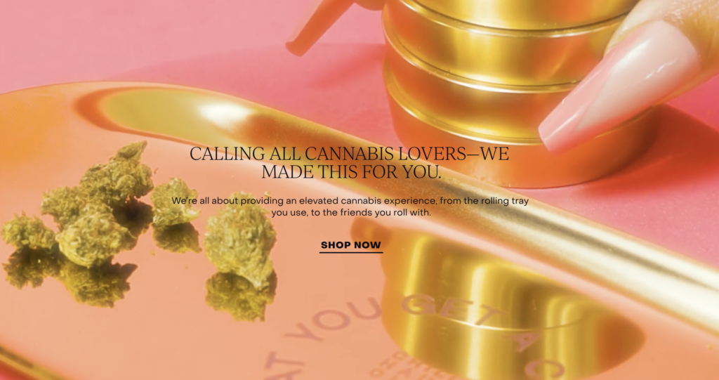
The Head of their Haushold is Micah Crawford—Founder, creative director, food and cocktail curator, cannabis justice advocate, scholar, and mom.
Long story short? She wears many hats, and between juggling all of those responsibilities, she found herself needing some serious chill.
But, when she started searching for a space to chill in the way she wanted to chill (aka a sublime, modern space with food + drinks that was also 420-friendly), she couldn’t seem to find anything even close.
So she decided to build the space she’d been dreaming of.
Keep reading for my simple single-product shop page formula, designed to make Google AND your future customers happy!
Clear headline with a good product photo
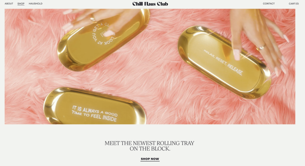
What: an easy-to-understand headline that describes what the product is, either atop or aside a great photo of the product
Why: to make customers aware of what the product is and to let them *see* the product in action at the same time
(If you’re selling a digital product, using stock photos or your brand photos is fine, but you’ll definitely want to put some sort of mock-up of what it looks like somewhere on this page!)
Attention-grabbing introduction
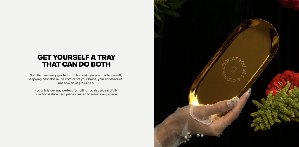
What: a small paragraph or two that explains the main benefit of the product, and speaks to the customer’s current situation
Why: to illustrate who the product is for and why they need it, so they’ll feel more confident in purchasing (because they’ll be sure it’s right for them if you do a good job of describing all the great parts about it in connection with why those things are so great!)
Product details
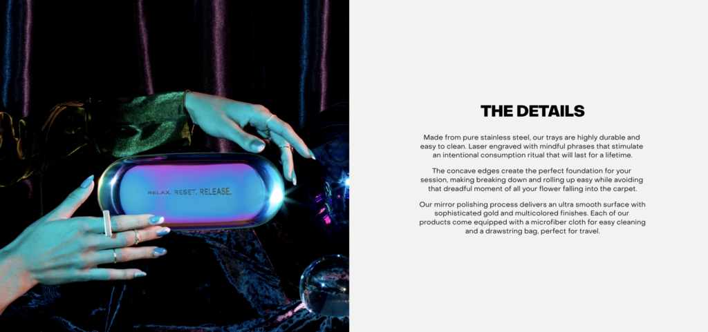
What: a small paragraph or list of details about the product, such as materials/ingredients used to make it, main selling points about the product, and anything a potential buyer may want to know before purchasing
Why: to convince people to buy your product using relevant information that might sway their decision
How: use as much specificity as possible, and try your best to answer the questions you know they’ll have
Usage details

What: an overview of all the different ways your product can be used or styled
Why: to showcase versatility and to create more selling points (aka reasons why people may want to buy it)
Founder’s note
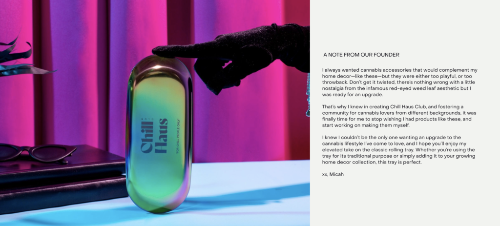
What: a brief blurb from the founder or creator of the product giving more context about their “why” behind creating the product (or any other information they want their readers to know about them)
Why: to create a deeper, potentially emotional, connection with the reader, inspiring them to want to support you and your business. Putting a face to a product or brand makes it more relatable and likable
Frequently asked questions

What: a collection of answers to the questions you know your reader will have about your product before potentially becoming a customer.
Why: to put people who are on the fence about buying your product at ease.
How: consider which questions your customers will have, and which questions your copy has not yet answered, and showcase 3-9 of them in an easy-to-read, user-friendly manner.
I prefer an accordion, like the one shown above, because it looks cleaner and doesn’t feel overwhelming (like layouts that show the entire question and answer do). Plus, accordions allow you to simply click on the question that you’re interested in, as opposed to reading through all of them; this makes a reader’s conversion time quicker, and increases the likelihood of a purchase.
Call to action

What: a statement inviting and encouraging an audience to take action
Why: there are two reasons (borrowed from this post!)
- Relationship building. The more of your copy they read, the more get to know you, then the more they’ll come to like you, then the easier it’ll be to trust you—making you the obvious choice to hire.
- SEO. The longer a user spends on your site, the more credible Google assumes you are, because it proves to them that your site is a cool place to hang out for a long amount of time (aka you found what you were looking for and you were satisfied with the recommendation their search results page gave you).
How: use the tips from this post!
You also may want to consider also adding…
- Lots of images and/or video.
- Mock-ups of what the product looks like, if it’s not a physical item.
- Shipping or downloading information.
- Measurements, specs, or assembly information.
Want to see the full product page in action?
Here she is 👇🏼 and she’s gorgeous, thanks to gorgeous visuals and website design by Wilda and Good Friends Studio!

Thanks so much for reading! And…
If we haven’t had the chance to *virtually* meet yet, hi! I’m Sara Noel—website copywriter and marketing mentor for creatives, copywriters, and all-around cool people. If you like my content and you want even more BTL in your life, subscribe to my newsletter!
Website Copywriter and Marketing Mentor really freaking passionate about helping business owners figure out how to market themselves online with ease.
Click on any of the below topics for more educational resources!
love this post? share it!
I publish ADHD-friendly episodes about marketing every Thursday.
I write website copy for main characters who want to be must-haves.
I teach business owners how to write the best website copy for their brand.
Subscribe for one marketing tip, once a week.
Hi, I'm Sara! Website Copywriter & Marketing Mentor.
Nice to meet you,
I'm your new solution!
PLOTTING HOW TO SOLVE YOUR PROBLEMS
Through what I like to call sales-focused storytelling, I'll help you find your brand's voice, perfectly position your offerings, develop your target market, and write copy that resonates with your ideal audience. And I'll do it all while keeping your personality at the forefront of every draft, to ensure that each word aligns with your true self.
lets work together
If you're a Main Character with big dreams of success and growth and you happen to have a big, scary blank document standing in your way every time you sit down to write your own website, sales, or email copy...
Curious about crafting a compelling narrative? I'm on it.
here's how I can help
Copywriting Services
01.
Writing your own website or sales page copy doesn't have to be something you stress over anymore. I'd love to work with you to craft conversion-friendly, SEO-optimized copy your readers will love.
DIY Your Website Copy
02.
Thinking about writing your own website copy instead of hiring me to do it? That's a great plan, too! I have a zillion resources designed to make it as easy as possible for you to DIY your site.
Mentorship Services
03.
There's no better feeling than having the complete support of a trusted, dedicated mentor by your side as you navigate your journey as a business owner. I'd love to be that person for you.
work together
learn more
learn more
speed talker friendly
for the yappers
calling all squirrels
business & marketing
lifestyle
adhd
hacks
copywriting
listen on spotify
listen on apple
Join me every single Thursday for the only marketing and mindset podcast you won't have to listen to on 2x speed.
read on substack
LISTEN TO MY PODCAST
One marketing tip, once a week.
Join thousands of marketers being greeted bright and early every Tuesday morning by ridiculous stories that seamlessly turn into tips about copywriting, email marketing, blogging, storytelling, website copy, SEO, and selling online.