Hi, I'm Sara!
HOW TO PICK THE RIGHT SHOWIT WEBSITE TEMPLATE FOR YOUR BUSINESS BASED ON YOUR AESTHETIC
Choosing a website template is a big commitment—and, usually, a big investment, too… so picking the right one can often feel like a challenge.
So, I’m here to swoop in and save you the hassle of scrolling through hundreds and hundreds of sites by helping you choose the right Showit website template for you, based on your aesthetic.
Now, I may just be a lil old website copywriter, but I promise you, I’ve got the eye for design, too.
(I just don’t offer it professionally, because, well, that’s hard. I said I have the eye; I didn’t say anything about the skill.)
Showit website templates are the focus of this post for two very important reasons:
#1 – Showit is the elite website hosting platform. Once you get the hang of it, it’s easy to use, and—this is their main selling point—easy to customize. Read why I chose it over Squarespace!
#2 – Showit website templates are gorgeous. I’d even go as far as saying they’re the most beautiful web design templates available on the lovely world wide web. And remember: I’m a website copywriter, so I’ve seen a lot.
Now that you know why Showit website templates are getting their own spotlight on the BTL blog today, let’s get into which website template is right for you & your business based on your aesthetic.

For the edgy entrepreneur
Why, yes, I am going to kick this post off with a template recommendation from my favorite website designer, thanks for asking.
This Kleist Creative template is perfect for you if you love black backgrounds and bold headlines with a bit of an edge.
To see the Narrative template in action, check out this site Sarah and I collaborated on for a Systems Expert.

For the do-it-all, done-for-you service provider
If you’ve ever Googled “Showit website templates” or, honestly, anything related to Showit website design or website templates in general, you’ve seen the iconic Tonic Site Shop. They’re everywhere, and they’ve earned it.
I already spent an entire post answering the question of whether or not Tonic Site Shop templates are worth it, so I won’t reiterate all of my “yes, absolutely!” reasons here, but what I will say is this: the Tonic template may be pricy, but the impression it’ll leave on your ideal clients is priceless.
Paper Plane is the go-to Tonic template, used by all different types of businesses and brands. It has every page you could possibly need, from classic home page to the podcast, coaching, and resource pages.
To see an example of this template in action, check out Duo Collective’s site – the BTL project I fondly refer to as ‘The Everything Website.’
Oh, and the best part? You get 15% off of ANYTHING from Tonic when you use code “btlcopy” at checkout.

For the chill, cool-girl freelancer
“Another Tonic template?”
…um, yeah? Didn’t you read the glowing review I gave above?
The French 75 is made for the effortlessly stylish entrepreneur. Both cute and classy, it works for any easygoing, feminine brand. Plus, bonus points: it leaves plenty of room for copy with its extensive page selection, while still giving the minimalist vibe.
Appealing with a pleasing aesthetic while also meaning business with an easy to navigate layout, there’s no going wrong with this template. Or truly any Tonic template, for that matter.
If you’re another need-to-see-it-to-believe person like myself, check out Tonic’s demo of the French 75 template here.
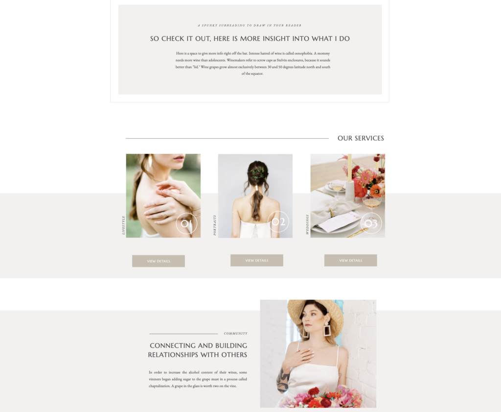
For the artsy + ambitious entrepreneur
AUGUST & PARK – QUILL AND CO. DESIGN
August & Park is made to capture the brightness and beauty of your brand. Its light color scheme serves as a perfect backdrop to compliment all of your brand’s images.
Both classy and bold, it features 16+ customizable pages to showcase your business, offering complete originality and individualism with no complicated techy coding bs.
Unless you’re into that — no shade if you are, just takes more time & effort, ya feel me?
So if you’re looking for fun and playful, but also seamless satisfaction , she may be the gal for you.
Check out the August & Park demo here.
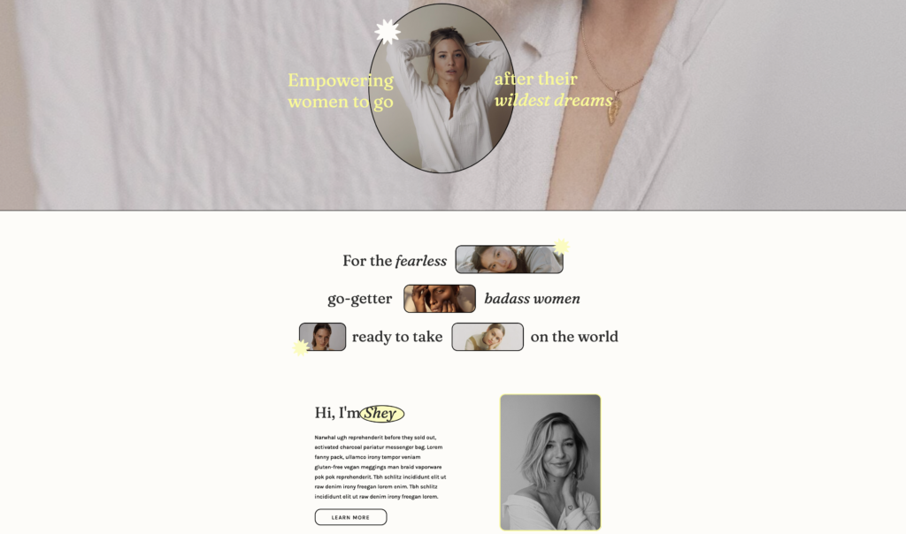
For the trendy one ready to take on the world
Don’t let the playful and bold appearance fool you — she’s here to get sh** done. This animated design offers an uncluttered aesthetic with plenty of space for your text. It’s fun and feminine, but lacks not an ounce of sophistication.
It’s like a breath of fresh air that includes a wave of empowerment in taking care of business.
If you’re the type of creative business owner that enjoys taking charge and showing clients who’s boss, you’re about to fall in love with this template.
You’ll never leave your clients second guessing with the confidence embedded into this template.
If you’re feeling like this is speaking to your search for the perfect template, click here to see the Phoebe-Soulkynd template.
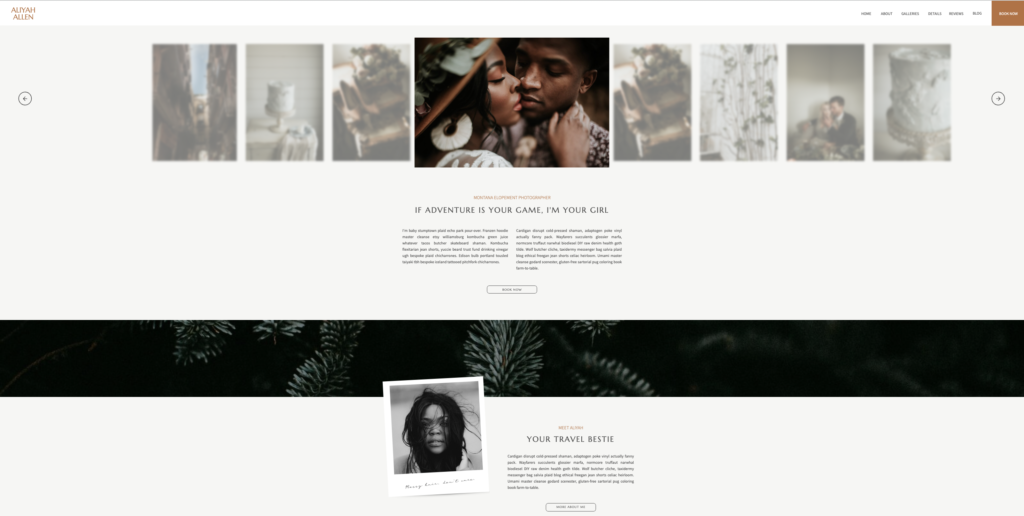
For the romantic earth sign
If you’re looking to captivate to an adventurous audience, search no further than this elegantly whimsical design.
Created intentionally with destination photographers in mind, clients will fall in love at the first glance of your site.
With it’s enchanting charm, there’s an immediate grasp of your readers attention by the romance sprawled across the page.
Itching to be further enticed? Don’t fret — take a peak at ALIYAH here.
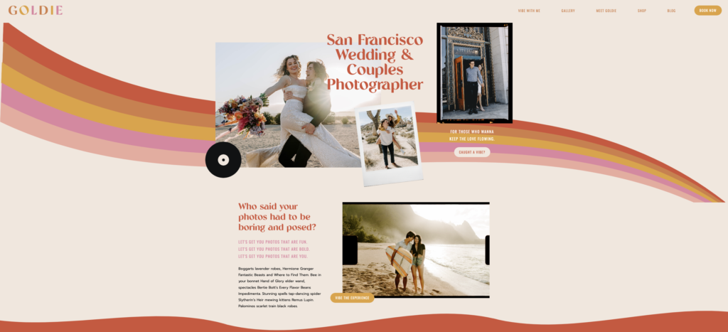
For the bold + colorful artist
There isn’t a single boring thing about Goldie. With a bright and colorful design, you can’t help but immediately smile in admiration of the beauty offered in this template.
The only thing this 70’s-esque design is missing is a bell bottoms and a disco ball.
Even with the record on the homepage, how can this not ignite an immediate desire to dance it out under some flashing lights?
No? Just me?
Created for couples photographers but versatile enough for all creators, this Showit templates offers 10+ pages.
As if that isn’t dazzling enough, several bonuses are included with your purchase — SEO checklist, Launch Checklist, and Editable Custom Icons & Illustrations — just to name a few.
Gotta see it? Click here for the demo.
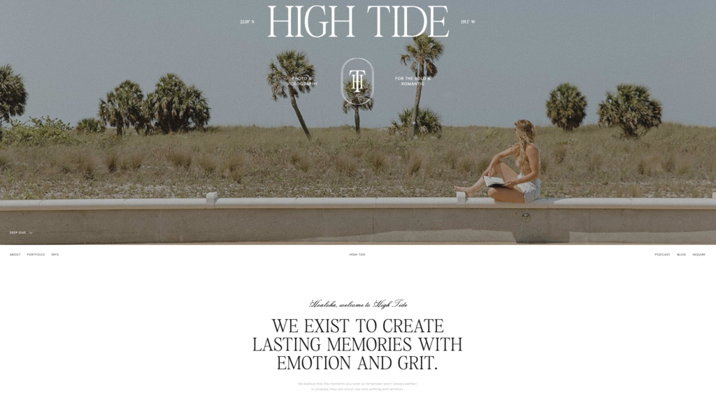
For the airy, breezy minimalist
Looking for a breath of fresh air? It can be found right here with High Tide.
With an aesthetic of serenity and peace, there’s a wave of calmness that ensues while exploring this template.
And it doesn’t just exist within the design. High Tide was created to grow alongside your business with included pages for all things podcast and sharing resources.
So, if you want your readers and potential clients to immediately feel a summer’s day peace, this is the one for you.
To exist for a little bit longer in this chill vibe, take a peek at the demo here.
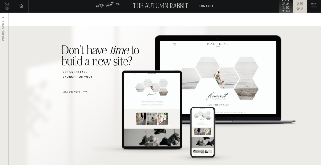
For the luxurious connoisseur of fine arts
This simplistic template is exactly that — what you see is what you get. The clean and timeless layout offers no hidden bells and whistles, providing longevity in its use.
The geographic imagery is another feature that immediately catches the client’s eye, letting the graphics speak for themselves.
Offering space for stand-out photography, this template is ideal for those with minimal copy.
Click here to admire the beauty.
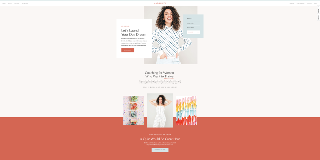
For the fun + flirty go-getter
No, your eyes do not deceive you.
It *is* another Tonic template.
I just can’t help myself — they’re that good. (And, of course, don’t forget: you get 15% off when you use code “btlcopy” with your purchase.)
This template is full of personality with its bright and flashy presence. And not only does it look inviting, there is a TON of incentive for marketing with its sales-driven outline.
This template is highly individual-focused with an array of option for the about page and custom blog design — a fantastic fit if you’re looking for something very me, myself & I (queue Beyoncé. Or G-Eazy… whichever one floats your boat).
Have your creative reign with Ms. Margarita. Take a look at her demo here.
Still have questions?
That’s fine—I’ve got answers, if ya want! Choosing a website template can be a stressful and difficult task. I’m here to make it a little less daunting by teaching you the things to look for.
Having a multitude of options presents a challenge right at the start. Slow your roll and focus on the aesthetic you want to create.
Are you the brave and bold, or do you find more peace in the simple and minimalistic?
Are you looking to include long-form copy, or would you rather graphics do the talking for you?
Do you have a lot to offer with your business, so multiple pages is an element you’re looking for?
It’s a lot to consider. It helps narrow down the search. You got this, I believe in you. And if you need me, you know where to find me.
If we haven’t had the chance to *virtually* meet yet, hi! I’m Sara Noel—website copywriter and marketing mentor for creatives, copywriters, and all-around cool people. If you like my content and you want even more BTL in your life, here are a few ways you can connect with me:
Subscribe to my newsletter! I send one marketing tip, once a week – and, according to my subscribers, it’s “the best marketing newsletter on the Internet” and “the only reason to wake up on Tuesday mornings.” So… yeah. You’ll love ‘er. 😏 Click here to subscribe!
Check out my services. I write website copy, sales pages, email sequences, blog posts, and brand messaging guides for entrepreneurs of all kinds! Maybe you’re my next favorite client.
Read the rest of my blog. It’s home to everything from copywriting tips, to marketing education, to freelance advice, to portfolio-worthy projects… if you like this post, you’ll love the blog. Here’s a quick roundup of my most popular posts.
Sign up for my web copy course. Actually, it’s not *only* about website copywriting—I also teach modules on copywriting basics, developing your target audience, search engine optimization, blogging, and email marketing.
Enlist me as your mentor. I have an entire in-depth blog post about my one-on-one consulting process for new and aspiring copywriters, if you’re interested in having a big-sis-style mentor to help you grow your freelance copywriting business & get results.
To get in touch with me directly, send me a DM or email sara@betweenthelinescopy.com. Have a great day!
Website Copywriter and Marketing Mentor really freaking passionate about helping business owners figure out how to market themselves online with ease.
Click on any of the below topics for more educational resources!

love this post? share it!
I publish ADHD-friendly episodes about marketing every Thursday.
I write website copy for main characters who want to be must-haves.
I teach business owners how to write the best website copy for their brand.
Subscribe for one marketing tip, once a week.
Hi, I'm Sara! Website Copywriter & Marketing Mentor.
Nice to meet you,
I'm your new solution!
PLOTTING HOW TO SOLVE YOUR PROBLEMS
Through what I like to call sales-focused storytelling, I'll help you find your brand's voice, perfectly position your offerings, develop your target market, and write copy that resonates with your ideal audience. And I'll do it all while keeping your personality at the forefront of every draft, to ensure that each word aligns with your true self.
lets work together
If you're a Main Character with big dreams of success and growth and you happen to have a big, scary blank document standing in your way every time you sit down to write your own website, sales, or email copy...
Curious about crafting a compelling narrative? I'm on it.
here's how I can help
Copywriting Services
01.
Writing your own website or sales page copy doesn't have to be something you stress over anymore. I'd love to work with you to craft conversion-friendly, SEO-optimized copy your readers will love.
DIY Your Website Copy
02.
Thinking about writing your own website copy instead of hiring me to do it? That's a great plan, too! I have a zillion resources designed to make it as easy as possible for you to DIY your site.
Mentorship Services
03.
There's no better feeling than having the complete support of a trusted, dedicated mentor by your side as you navigate your journey as a business owner. I'd love to be that person for you.
work together
learn more
learn more
speed talker friendly
for the yappers
calling all squirrels
business & marketing
lifestyle
adhd
hacks
copywriting
listen on spotify
listen on apple
Join me every single Thursday for the only marketing and mindset podcast you won't have to listen to on 2x speed.
read on substack
LISTEN TO MY PODCAST
One marketing tip, once a week.
Join thousands of marketers being greeted bright and early every Tuesday morning by ridiculous stories that seamlessly turn into tips about copywriting, email marketing, blogging, storytelling, website copy, SEO, and selling online.