Hi, I'm Sara!
Learning how to write headlines (especially really freaking awesome ones) is hands-down one of THE hardest parts of copywriting.
In fact, I’m willing to bet that most copywriters agree, because the general Official Copywriting World consensus is that headlines are to be written last. And I have a theory that it’s because we need to cross off quite literally everything else from our to-do list before we finally muster up the courage to tackle them.
Here’s why I think people find writing headlines to be so difficult:
1 — There’s a lot of pressure. Only 20% of people read past the headline. And I’m really sorry for telling you that statistic and putting even more pressure on your headline-drafting.
2 — They’re often the sole reason someone will click and keep reading. You could have the best content on your website, or in your blog post, or in your email… but if the first line they read doesn’t catch their eye, kiss that reader goodbye. (Rhyme: unintentional. Now considering an alternative career as a rapper.)
3 — You have limited space. The ideal headline length—if we’re talking SEO—is about 55 characters. This fact often makes people with a lot to say (me) start stress-sweating.
The most intimidating headline of all? Your homepage headline. The big kahuna.
(I don’t know why I just said that. I’d never say “big kahuna” in real life. I just ignored Primary Copywriting Lesson Number One: write like you talk. Do as I say, not as I do. Anyway.)
The big-daddy, above-the-fold sentence that lives front-and-center on your website’s homepage is a make-or-break moment for your web traffic.
(Was that a record for the most hyphens in one sentence? Probably.)
And, on top of that, you’re gonna want to make it keyword-rich.
[Quick review: keyword-rich = including your ‘main’ keyword—aka the one you want to be recognized, ideally on Page One of Google (eventually, hopefully?) for—and seamlessly integrating it into the sentence.]
This headline not only signals to search engines when to recommend your site (and who to recommend it to), but it also needs to immediately capture your ideal clients’/customers’ attention, so they’ll keep reading.
The ultimate job of a headline? Get your audience to read the next line after that. And then the cycle repeats. With every line of copy, we want our readers to move on to the next one, Domino style.
SO, let’s fuel your headline-drafting fire with some good, old-fashioned inspo and helpful headline copywriting tips along the way.
Keep reading to see some killer homepage headlines and why they work so well.
How to write headlines that are actually good? Start with the 3 “S”s.
#1 – Simple.
Stupid-simple, to be precise. The best headlines are so direct and so simple that they almost trick people into believing the copy is extra amazing and clever.
In reality, though, the “stupid-simple” effect is just the copywriter being really great at target audience research, and knowing exactly what you’re thinking, hoping, and needing, and then saying that in YOUR voice.
#2 – Succinct.
Make your point briefly and clearly. You’ve got limited space (remember: 55 characters is the Google-approved sweet spot) and limited time, so use it wisely.
You can use other areas on the page to explain, but for now, keep it to the point. Saying less actually makes your copy more impactful (I know, it’s hard to believe I’M telling you to say less as a certified long-story-long type of girl.)
#3 – Specific.
The main goal of your headline is to get your reader to continue on to the next line of copy, and the line after that, and the line after that. When your copy is specific, it speaks directly to your intended audience, and when they read it, there’s no doubt at all about whether it’s for them. Think of your headline as a “HEY, YOU!” statement.
Specificity may not be sexy, but it does stop your audience in their tracks and grab their attention. By saying something that actually calls them out and piques their interest, you keep them engaged.
THE ULTIMATE GOAL? MAKE ‘EM WANT IT.
Want to see some great headlines in action? Give me one sec—we’re getting there.
First things first, I want to show you a really great headline with an easy-to-recreate formula.
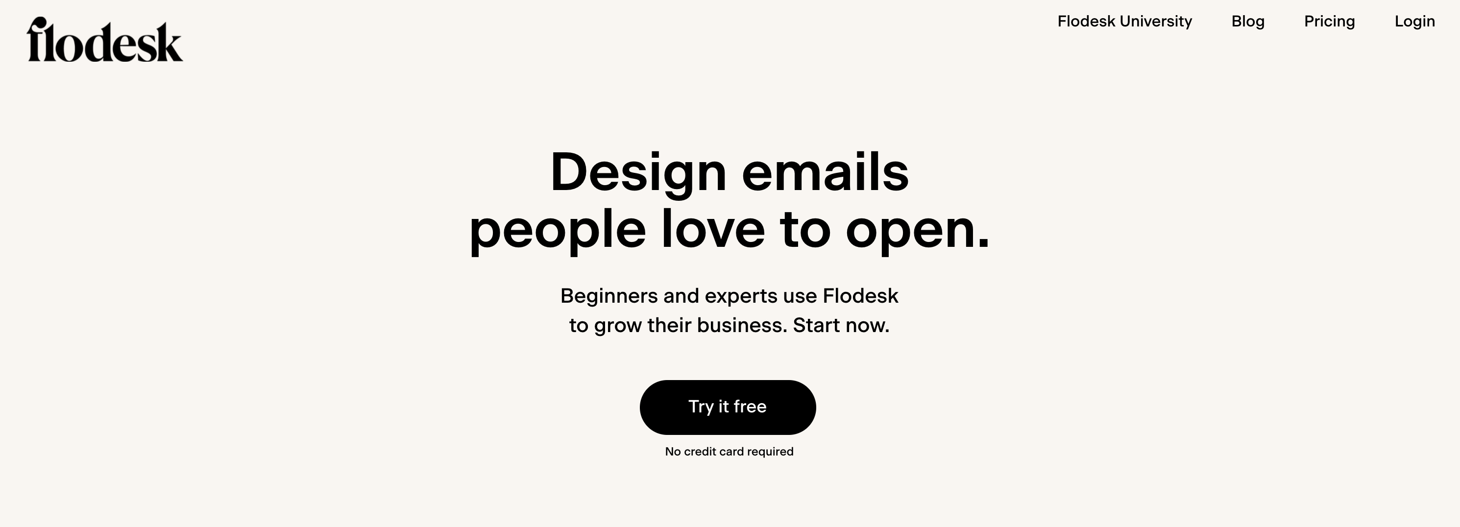
I was considering leaving this headline for an eventual “how to write value propositions” blog post, but I didn’t want to deprive you of the perfect simple headline.
Like, this is actually textbook-worthy perfect. It may not seem like anything special, but let me explain:
As soon as you land on flodesk.com, this is what you see: a stupid-simple explanation of exactly what you’ll be able to do with Flodesk.
Note that I said what you’ll be able to do, and not what Flodesk does. Because Flodesk has purposely written this headline so you’ll inevitably envision what YOUR experience with them will be.
Every single word in this 28-character headline was intentional.
“Design” so you’ll know that your emails will be aesthetically pleasing.
“Emails,” duh, we’re talking about an email marketing platform here.
“People” to be inclusive of all industries.
“Love” to demonstrate how your emails will make people feel.
“Open” instead of ‘read’ because they know that getting your emails opened is the next thing that happens after sending emails out.
Obviously, your hope is that people will read them—their goal with this headline was to make everything sound EASY, so they instead went with the first step, instead of the main goal.
Flodesk is clearly demonstrating that they’ve passed Copywriting 101: Benefits over Features.
They don’t say shit about features of their platform—this is a mistake I see people make all the time on their homepage—only the benefits you will receive in using it. You’ll get the privilege of designing emails people love to open. People will actually open your emails! What a dream.
They also want you to know that when you use their email marketing service, not only will it be easy, but it will also look professional. After all, as their subheading states, both “beginners and experts use Flodesk to grow their business.”
This subheading addresses the “is it for me?” objection, because if beginners and experts use it, that means everyone in between does, too.
Then, after answering that objection before you even had time to think it, they’ve explicitly stated how easy it is to get started using the platform in 3 different ways: start now, try it free, and no credit card required. Hook, line, and sinker—you’ve just signed up for Flodesk.
And that, my friend, is the perfect, stupid-simple headline, supported by a perfect subheading, to make the perfect value proposition.
(And if it’s done its job of convincing you it’s also the perfect email marketing platform for your business, I’ll go ahead and throw my two cents in & tell you that it is. Use this link or code “btlcopy” for 50% off your membership.)
Okay, now it’s time for the headline examples that pass the 3 “S”s:
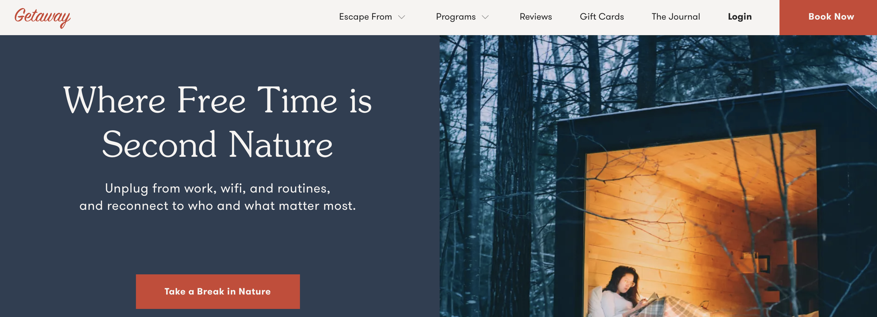
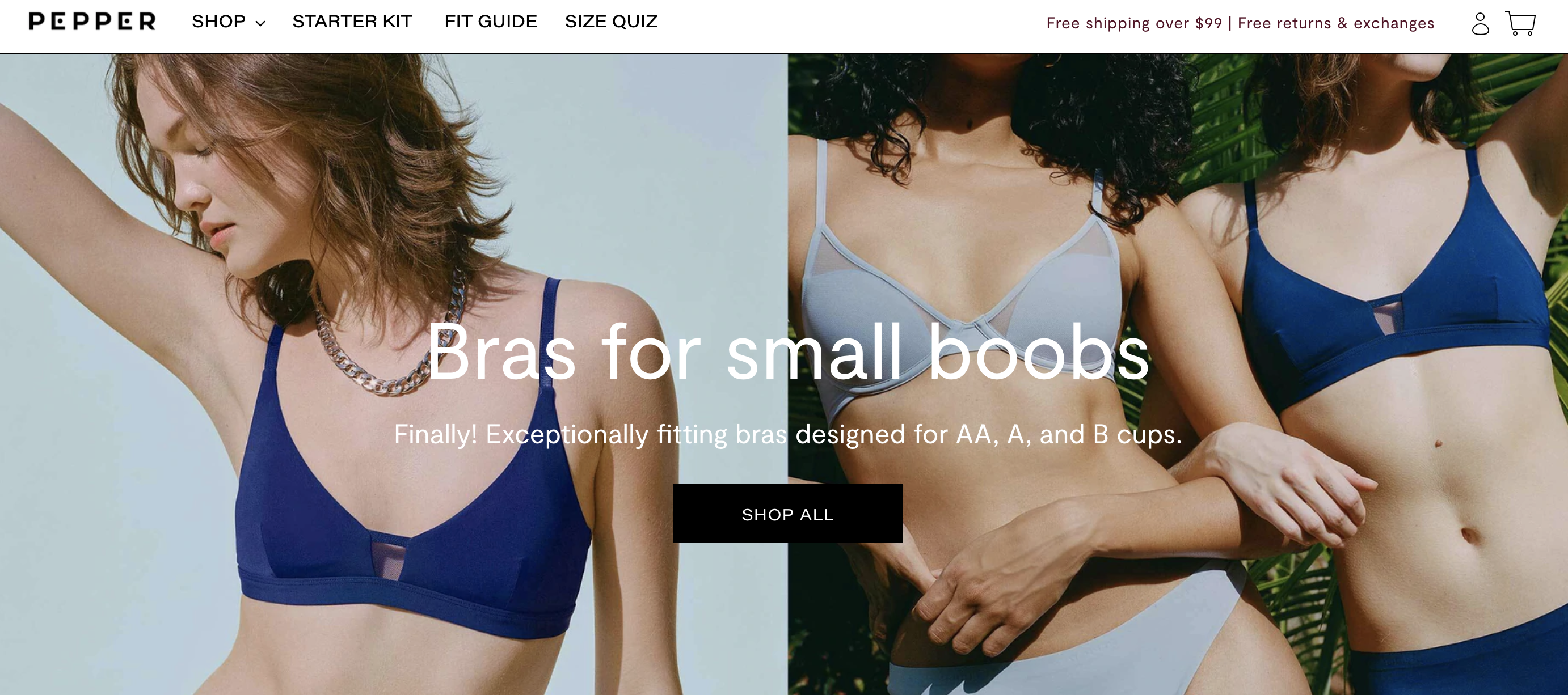
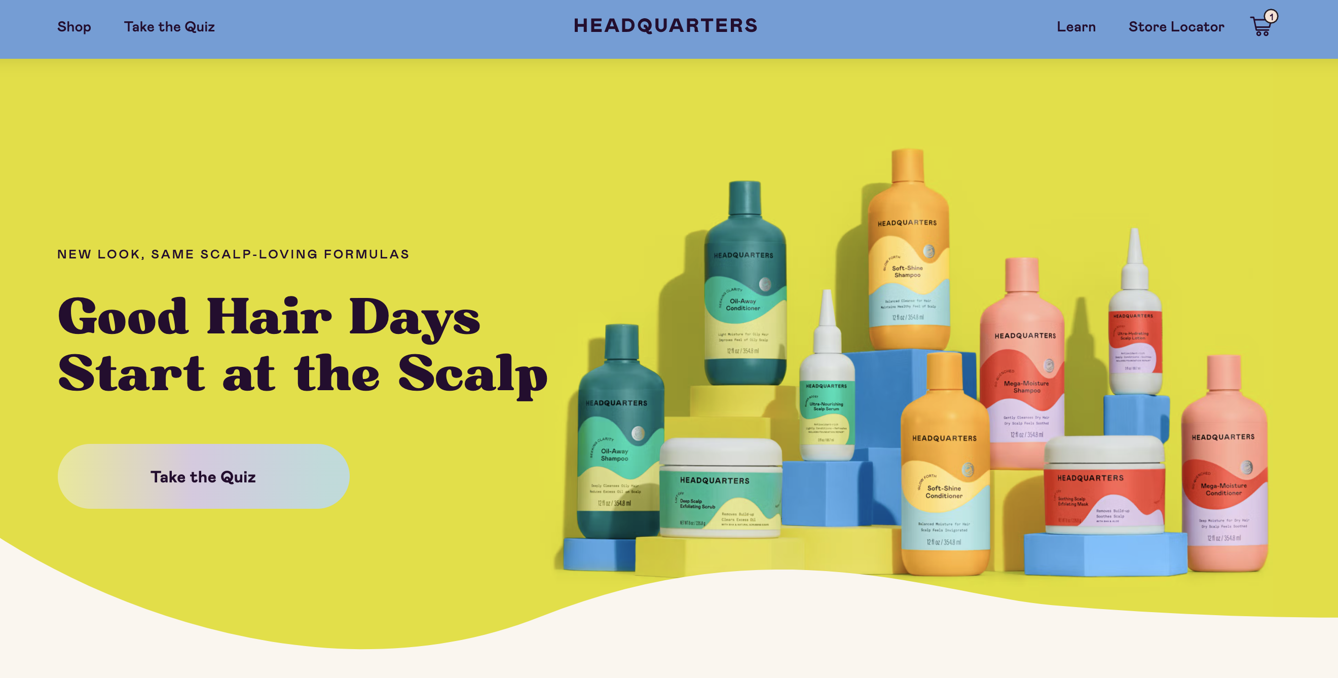
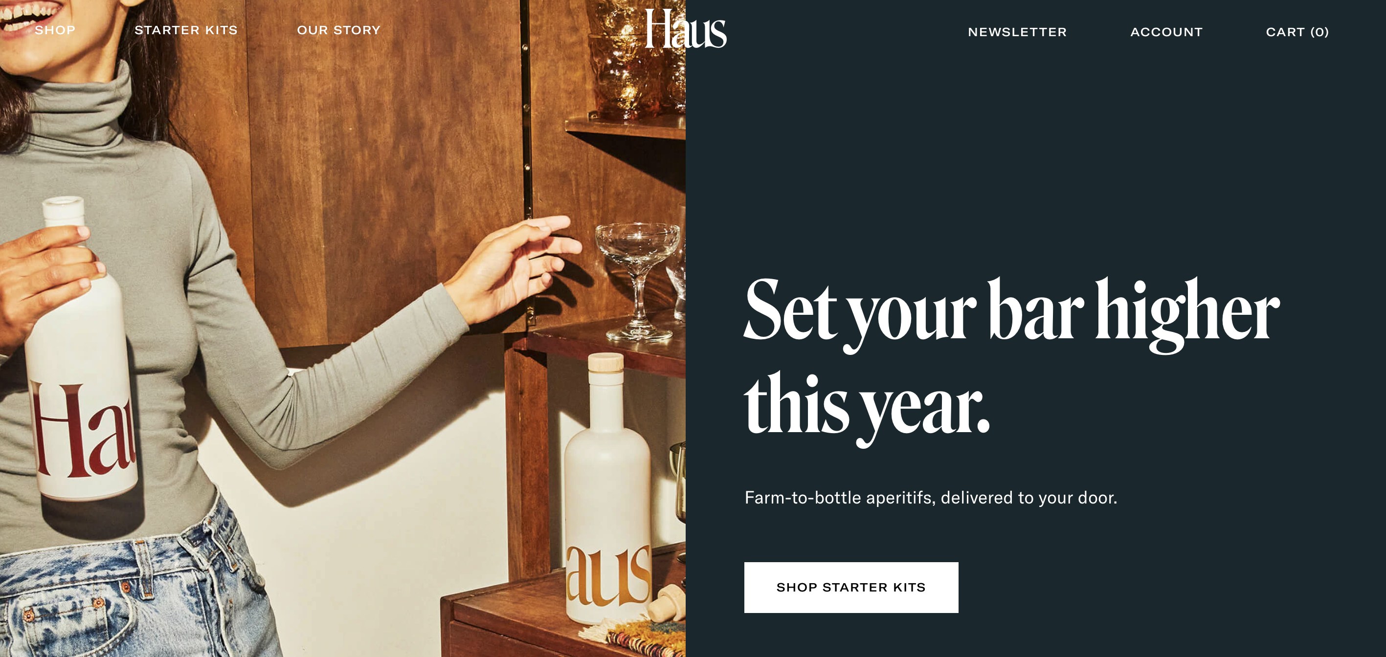
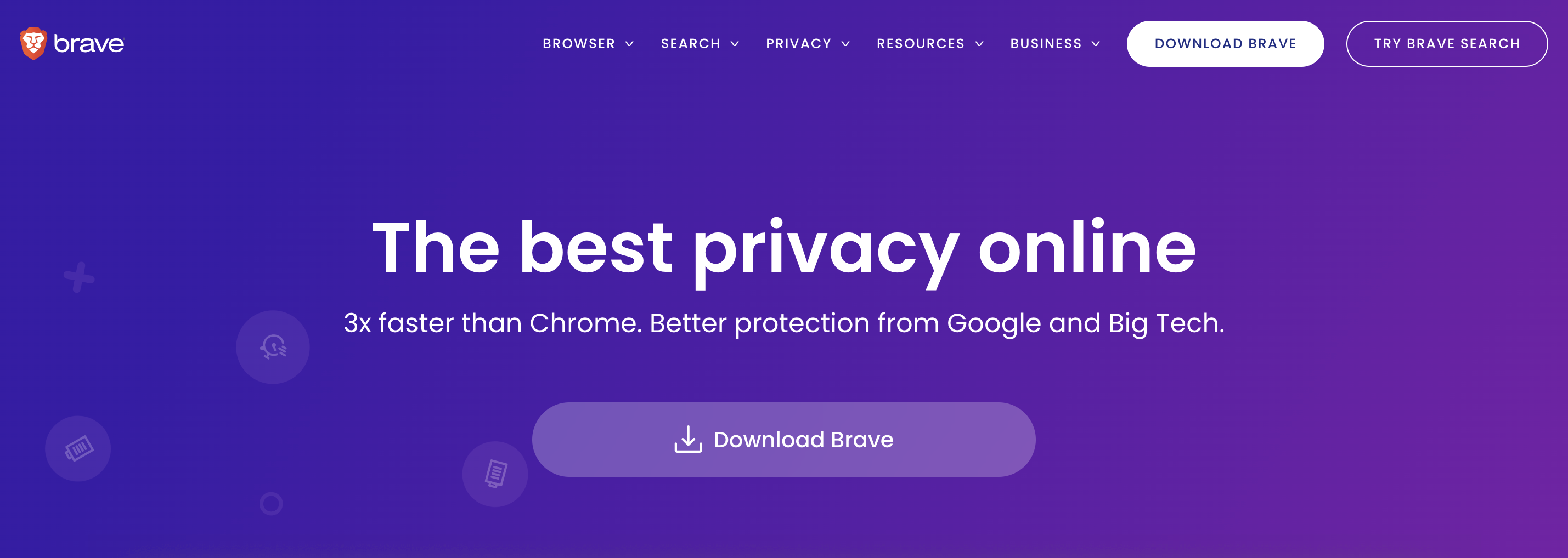
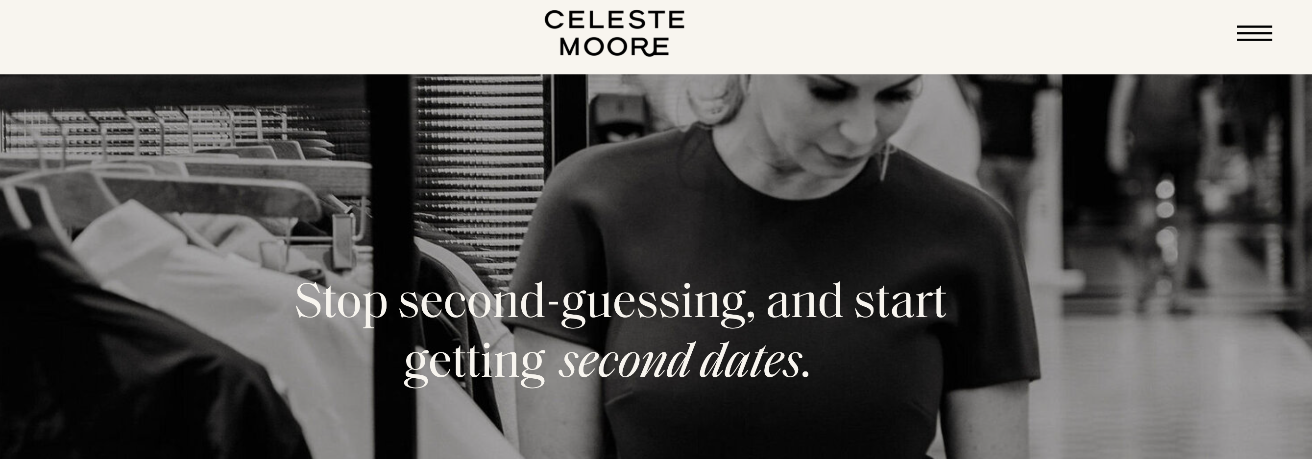
(By the way! This^ one is from my client, Celeste, on her About page. I love her website so much. Check out the case study about it right here!)
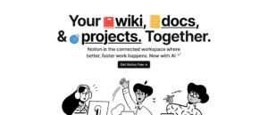

Wait! Before you go—there’s actually one more “S” I want to tell you about.
SPICE.
I’m not listing this as a formal “S” of headline writing, because spicing things up isn’t a necessary part of the Best Headline Ever Formula, and it doesn’t work in all situations.
Take the Flodesk example from above. That headline worked insanely well, and it didn’t need to add any spice. In fact, it would’ve probably been inappropriate and weird, and cheapened the integrity of the headline.
As I mentioned above, the goal is to keep your peeps reading. And what’s more exciting than a little bit of unexpected spice? (When the vibe—and brand voice—is right, of course.)
Here are a few ways you can do that:
- Say something unexpected, by adjusting a common cliche or reference to fit your message.
- Don’t use any big claims. (People would rather buy from “world’s okayest” than “world’s best” because it sounds more authentic.)
- Add a statistic that they may not quite believe at first.
- Get a little bit cheeky and implement an innuendo.
- Use a relevant pop culture reference.
- Ask a seemingly irrelevant question.
(Want more ideas for spicing headlines up? I have about a million. In my online course, Site Series® SPRINT , & I’ll teach you even MORE about writing great headlines! PLUS—this is the whole point, actually—how to write website copy that converts.)
I do have to leave you with a disclaimer about the whole *spice* thing, though.
Cardinal copywriting rule: never sacrifice clarity for cuteness, because confusion is the enemy of conversion, and more often than not, going too hard with the “spice” (or the cute/clever) factor doesn’t land as well as you think it’s going to…
But when it does land, and it’s used appropriately, it’s perfect.
Want to learn more about writing the best headlines, or writing your website copy in general?
I’M YOUR GURL. My website copywriting course is THE ?? COURSE ?? for you if you’re hoping to learn how to write GOOD website copy FAST, while keeping it EASY.
My exact process for writing website copy is outlined in easy-to-understand sprints, so you can actually FINISH your website copy draft, and not just stare at it mocking you from the graveyard of your Google Drive.
>> Here’s everything you’ll learn in the website copywriting course!
I hope you found this post helpful! To get copywriting tips delivered to your inbox Tuesday morning, make sure you’re subscribed to my newsletter!
Website Copywriter and Marketing Mentor really freaking passionate about helping business owners figure out how to market themselves online with ease.
Click on any of the below topics for more educational resources!

love this post? share it!
I publish ADHD-friendly episodes about marketing every Thursday.
I write website copy for main characters who want to be must-haves.
I teach business owners how to write the best website copy for their brand.
Subscribe for one marketing tip, once a week.
Hi, I'm Sara! Website Copywriter & Marketing Mentor.
Nice to meet you,
I'm your new solution!
PLOTTING HOW TO SOLVE YOUR PROBLEMS
Through what I like to call sales-focused storytelling, I'll help you find your brand's voice, perfectly position your offerings, develop your target market, and write copy that resonates with your ideal audience. And I'll do it all while keeping your personality at the forefront of every draft, to ensure that each word aligns with your true self.
lets work together
If you're a Main Character with big dreams of success and growth and you happen to have a big, scary blank document standing in your way every time you sit down to write your own website, sales, or email copy...
Curious about crafting a compelling narrative? I'm on it.
here's how I can help
Copywriting Services
01.
Writing your own website or sales page copy doesn't have to be something you stress over anymore. I'd love to work with you to craft conversion-friendly, SEO-optimized copy your readers will love.
DIY Your Website Copy
02.
Thinking about writing your own website copy instead of hiring me to do it? That's a great plan, too! I have a zillion resources designed to make it as easy as possible for you to DIY your site.
Mentorship Services
03.
There's no better feeling than having the complete support of a trusted, dedicated mentor by your side as you navigate your journey as a business owner. I'd love to be that person for you.
work together
learn more
learn more
speed talker friendly
for the yappers
calling all squirrels
business & marketing
lifestyle
adhd
hacks
copywriting
listen on spotify
listen on apple
Join me every single Thursday for the only marketing and mindset podcast you won't have to listen to on 2x speed.
read on substack
LISTEN TO MY PODCAST
One marketing tip, once a week.
Join thousands of marketers being greeted bright and early every Tuesday morning by ridiculous stories that seamlessly turn into tips about copywriting, email marketing, blogging, storytelling, website copy, SEO, and selling online.